Moving Things Without Moving Them
 Pulkit
· 7 min read · Design Engineering
Most animations you'll write use the
transform
property. Not margins. Not positioning. Not width or height. Transforms.
There's a reason for this. Transforms don't affect layout. When you move an
element with
translateX(100px), the browser doesn't recalculate where every other element should go. The
element visually shifts, but as far as the document is concerned, it never moved.
This is why transforms are so performant. They skip the expensive layout and paint steps entirely. The GPU takes over, and your animation runs at 60fps without breaking a sweat.
But transforms are more than just a performance trick. They're a complete toolbox for spatial manipulation. Translation, rotation, scaling, skewing, even perspective and 3D effects. Before diving into keyframes and animation libraries, you need to understand this foundation.
TL;DR
- Transforms don't affect layout. The element's original position is preserved in the document flow. Other elements don't shift
-
Four building blocks.
translate()moves,rotate()spins,scale()resizes,skew()distorts -
Order matters.
rotate(45deg) translateX(100px)is completely different fromtranslateX(100px) rotate(45deg) -
Percentages are relative to the element itself.
translateY(100%)moves the element by its own height - Transform origin is your pivot point. It determines where rotations and scales happen from
-
3D requires perspective.
Without it,
rotateXandrotateYlook flat
Transforms Live Outside the Flow
When you position an element with
margin,
padding, or
top/left, you're changing where the element actually exists in the document. Other
elements respond. They shift, wrap, or resize to accommodate the change.
Transforms work differently. They're applied after layout is calculated. The browser figures out where everything goes, then transforms are applied visually on top. It's like placing a sticker on a window. The window doesn't change. The sticker just sits there, looking like it's part of the view.
Watch how the margin change pushes the sibling element down, while the transform leaves it untouched. Both buttons appear to move the same distance, but they have completely different effects on the layout around them.
This has practical implications. Want to animate an element's position? Use
transform: translateX()
instead of
left. Want to grow an element on hover? Use
transform: scale()
instead of
width. The visual result might look the same, but one triggers expensive layout
recalculations on every frame while the other runs entirely on the GPU.
The Four Transform Functions
CSS gives you four fundamental ways to transform elements.
Translate for Movement
translate()
moves an element along the x and y axes. Positive values go right and down. Negative
values go left and up.
.element {
  transform: translate(50px, 20px);
}

.element {
  transform: translateX(50px);
}

.element {
  transform: translateY(20px);
}
The single-axis versions are cleaner when you only need to move in one direction. I use them almost exclusively because they're more readable and easier to reason about.
The percentage trick: Unlike margin or padding, percentages in
translate are relative to the element's own dimensions, not its parent.
translateX(100%)
moves the element to the right by its own width.
translateY(-100%)
moves it up by its own height.
This is incredibly useful for animations where elements need to move based on their
own size. Drawer components that slide off-screen use
translateY(100%)
because the drawer always moves by exactly its height, regardless of whether
that's 200px or 800px.
Scale for Resizing
scale()
multiplies the element's size. A value of
1
is the original size.
2
doubles it.
0.5
halves it.
.element {
  transform: scale(1.5);
}

.element {
  transform: scaleX(0.8);
}

.element {
  transform: scale(1.2, 0.9);
}
Unlike changing
width
and
height, scaling affects the entire element including its children. Scale a button and its
text, icons, and borders all scale proportionally. This is usually what you want for
hover effects and enter/exit animations.
Notice how
scale()
keeps everything proportional and doesn't affect layout, while animating
width
and
height
still triggers layout reflow.
A tip: Never animate from
scale(0). Things in the real world don't pop into existence from nothing. It looks
unnatural. Instead, start from something like
scale(0.95)
or
scale(0.8)
combined with an opacity fade. The element feels like it's entering rather than
materializing.
@keyframes enter {
  from {
    opacity: 0;
    transform: scale(0.95);
  }
  to {
    opacity: 1;
    transform: scale(1);
  }
}
Rotate for Spinning
rotate()
spins an element around its center (by default). Positive values rotate clockwise,
negative values rotate counter-clockwise.
.element {
  transform: rotate(45deg);
}

.element {
  transform: rotate(-90deg);
}

.element {
  transform: rotate(0.5turn);
}
You can use degrees, radians, or turns. I stick with degrees because they're the most intuitive.
Rotation is powerful for loading spinners, icon transitions (hamburger to X, arrow to chevron), and decorative effects. It's also essential when combined with translate for more complex animations like items flying into a trash bin or cards being dealt.
Skew for Distortion
skew()
tilts an element along its axes, creating a parallelogram effect.
.element {
  transform: skew(10deg, 5deg);
}

.element {
  transform: skewX(15deg);
}
Skew is the least commonly used transform function. It's hard to make skewed elements look good in most UI contexts. But it has its moments for creative effects, italic-like text styling, or building parallelogram shapes without images.
The Order Trap
Here's where transforms get tricky. When you chain multiple transform functions, they're applied from left to right. This means the order changes the result.
.element-a {
  transform: translateX(100px) rotate(45deg);
}

.element-b {
  transform: rotate(45deg) translateX(100px);
}
These look similar but produce completely different results.
What's happening: In the first case, the element translates first (moving right), then rotates. After rotation, the element's "right" direction has changed, so the translation already happened along the original axes. In the second case, the element rotates first, then translates, so it moves 100px along the rotated diagonal. The final position is different.
Think of it like this: Imagine you're standing facing north. "Rotate 45 degrees, then walk forward 10 steps" ends you up somewhere different than "walk forward 10 steps, then rotate 45 degrees."
The mental model that helps me: read transforms left-to-right as the order of operations. The leftmost function happens first.
transform: translateX(50px) scale(1.2) rotate(15deg);
The element first translates 50px, then scales up, then rotates 15 degrees. Each transform builds on top of the transformed state from the previous one.
Transform Origin
By default, transforms happen from the center of the element. But you can change this
anchor point with
transform-origin.
.element {
  transform-origin: top left;
  transform: rotate(45deg);
}

.element {
  transform-origin: center bottom;
  transform: scale(0.8);
}

.element {
  transform-origin: 100% 50%;
  transform: rotate(-90deg);
}
The origin point matters most for rotation and scaling. A scale from the top-left corner feels different from a scale from the center. A rotation around the bottom edge creates a "door opening" effect.
Common patterns:
| Transform Origin | Effect | Good For |
|---|---|---|
center
(default)
|
Transforms from middle | Buttons, icons, general scaling |
top left
|
Anchors top-left corner | Dropdown menus, expanding panels |
bottom
|
Anchors bottom edge | Rising elements, tooltips above |
top
|
Anchors top edge | Tooltips below, dropdowns |
For tooltip animations, setting the origin to the side closest to the trigger makes the animation feel connected. A tooltip above a button should scale from its bottom edge, as if it's growing out of the button.
Thinking in 3D
CSS can do 3D transforms too.
rotateX()
rotates around the horizontal axis (think of a
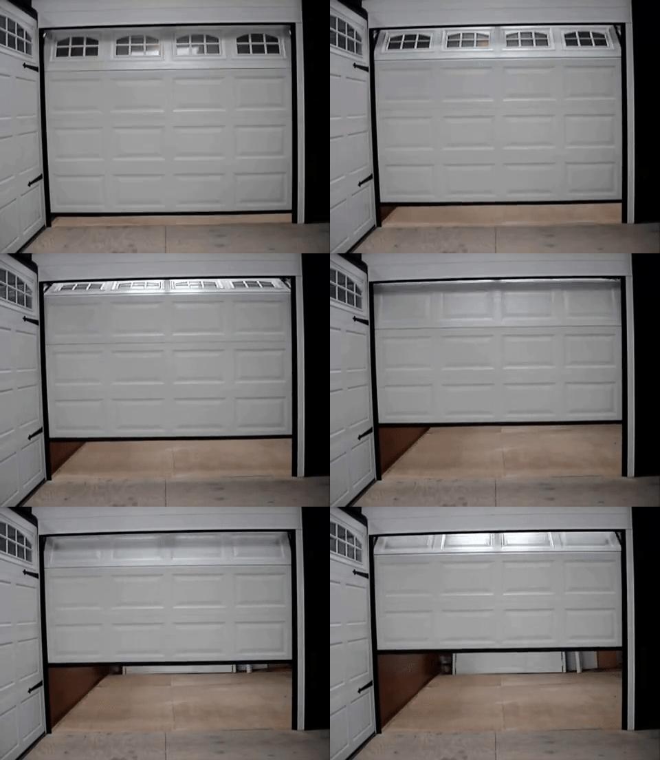 ).
).
rotateY()
rotates around the vertical axis (think of a
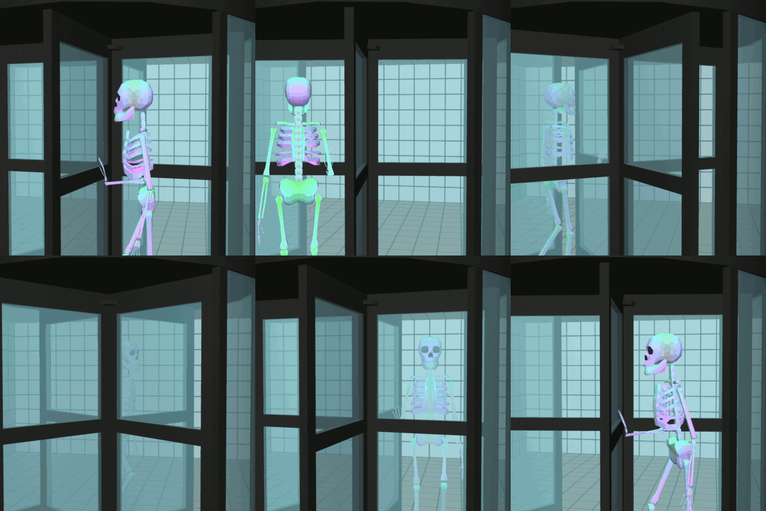 ).
).
rotateZ()
is the same as regular
rotate().
But there's a catch. Without perspective, 3D rotations look flat.
.flat {
  transform: rotateY(45deg);
}

.with-depth {
  perspective: 800px;
  transform: rotateY(45deg);
}
Perspective defines how far the viewer is from the z-plane. Smaller values create more dramatic perspective (things closer feel much bigger). Larger values create subtler perspective (more like looking from far away).
The perspective property goes on the parent. The transforms go on the children. This creates a shared perspective space where all children appear to exist in the same 3D environment.
.container {
  perspective: 1000px;
}

.card {
  transform: rotateY(15deg);
  transition: transform 300ms ease-out;
}

.card:hover {
  transform: rotateY(-15deg);
}
For interactive 3D effects, you'll also want
transform-style: preserve-3d
on containers to maintain 3D positioning of nested elements.
This card tilts based on mouse position using
rotateX()
and
rotateY(). The perspective on the container gives the rotation depth, making one edge appear
closer than the other.
translateZ and 3D Movement
Beyond rotation, you can move elements in 3D space with
translateZ(). Positive values bring the element closer to the viewer. Negative values push it
away.
.container {
  perspective: 600px;
}

.closer {
  transform: translateZ(100px);
}

.further {
  transform: translateZ(-100px);
}
This creates a parallax effect without JavaScript. Elements at different z-positions move at different speeds when the container scrolls or the parent transforms.
You can also use
translate3d(x, y, z)
to set all three axes at once.
Performance Considerations
All transforms are GPU-accelerated, but there are still best practices.
Stick to translate, scale, rotate, and opacity. These are the "safe" properties that the browser can optimize completely. Skew is also fine but less common.
Avoid animating transform-origin. Changing the pivot point during an animation creates strange visual artifacts. Set it once and leave it.
Use will-change sparingly. Telling the browser
will-change: transform
can help with complex animations, but it creates a new compositor layer. Too many
layers hurt performance instead of helping.
.element {
  will-change: transform;
}
Only add this if you're seeing jank in DevTools and have identified that element as the culprit.
Common Transform Patterns
Here are patterns I use constantly.
Button press feedback:
Slide-in from below:
Shake for error:
Flip card:
Conclusion
Transforms are the backbone of CSS animation. They move, rotate, scale, and skew without touching layout. They run on the GPU. They chain together for complex effects.
The key concepts to internalize: transforms don't affect document flow, order matters when chaining, percentages are relative to the element itself, and 3D requires perspective.
Most animations you build will use some combination of
translate(),
scale(), and
rotate(). Master these three and you can create almost any motion effect. The fancier stuff
like 3D transforms and perspective are tools for specific situations, not everyday
necessities.
Before reaching for an animation library, ask yourself: can I do this with transforms? Often the answer is yes, and the result will be lighter and more performant than any JavaScript solution.